I started researching to come up what fits this shoe brand. The shoes are made fair-trade in Africa, the target audience doesn't want to look too alternative in these shoes and the company want to show in their design that they help workers in Africa who make their shoes.
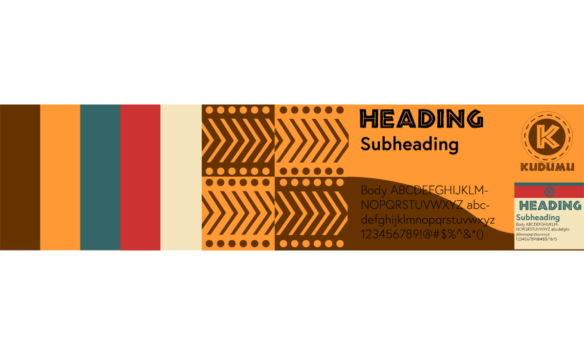
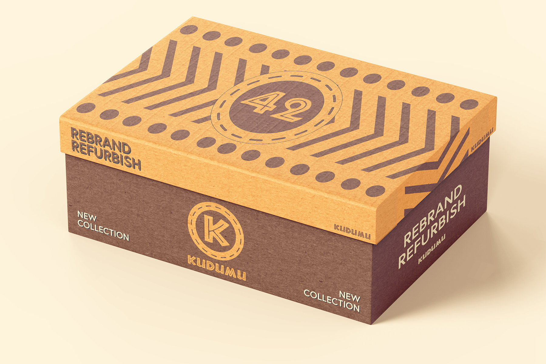
With this information, I could start creating my design. I started with the name. The shoes are sustainable to the environment. With that in mind, I came up with the idea to use the word 'Sustainable' in Swahili, the most spoken language in Africa. With that, I came up with the name 'Kudumu'. The font I chose was a typical African-safari font. This font was used for all the headers in the design and for the 'K' in the logo.
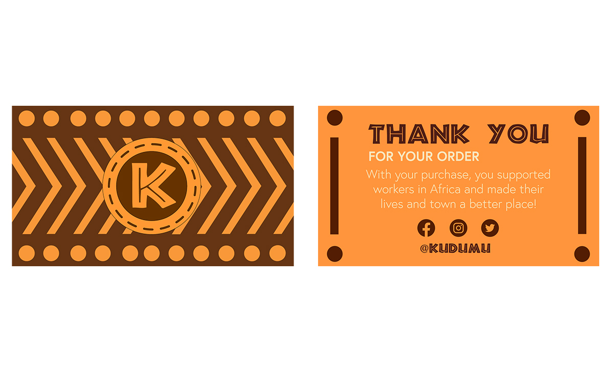
After that, I started working on the logo. I had multiple sketches and chose a logo with the K and a hand that hugs the logo. The hugging hand stands for the company caring about their workers. However, my teachers weren't pleased with that. The hand was a bit "too much". They said that the 'K' could already be enough. With that in mind, I redesigned my logo. The shoes are sustainable and made from used tires. So, I made on the outside of the logo a tire. I designed this tire, so it also looks like a sort of button where your shoelaces go into, or the lines of the stitching on the shoe. I was satisfied with this logo, and so were my teachers.