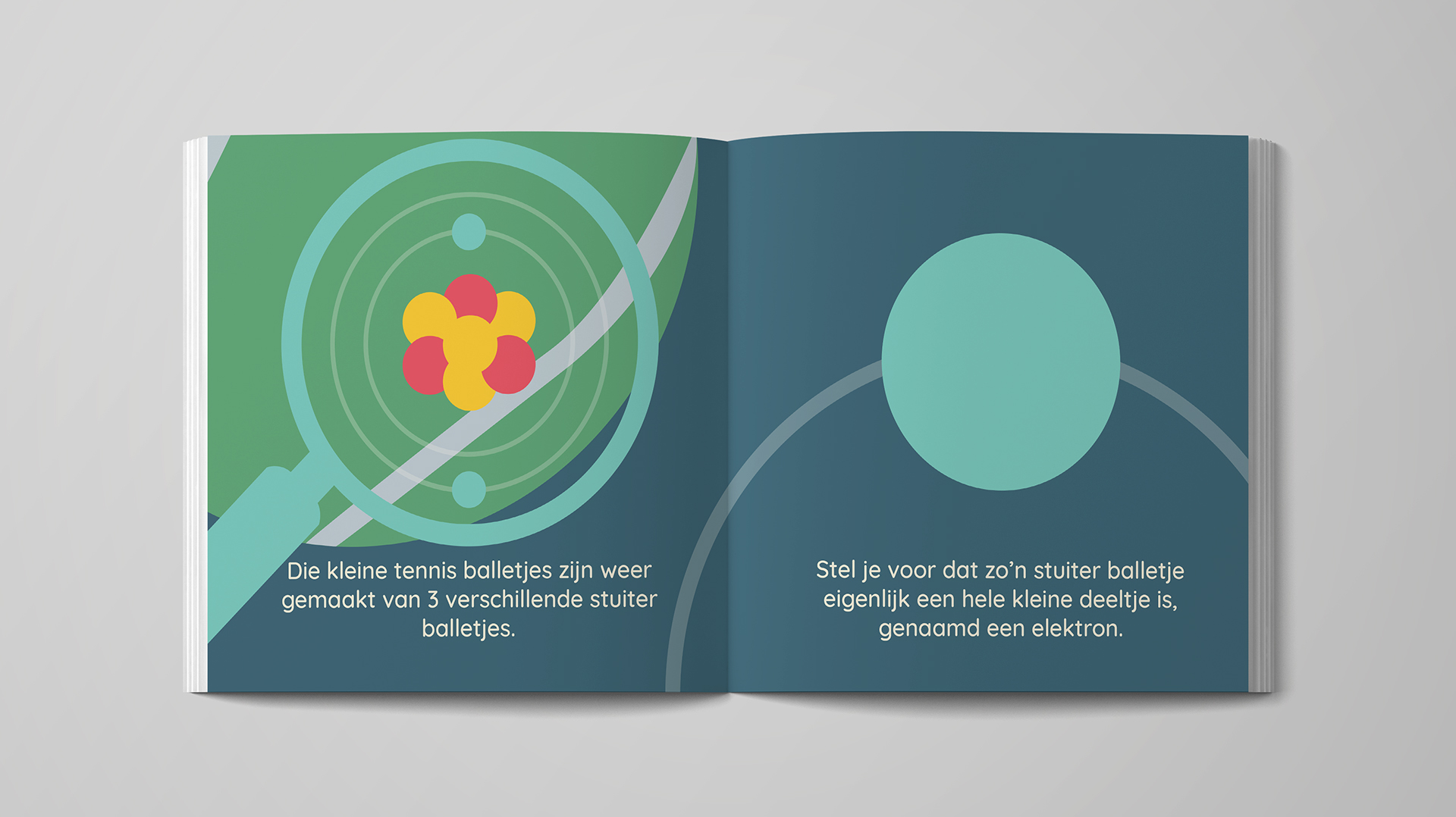
Explaining the subject with a lot of illustrations and changing difficult words and objects like quarks and molecules to recognizable objects like tennis balls and footballs, makes a lot more sense to a child. So I created a story that explains quantum superposition with simple objects and a lot of illustrations which are visually appealing to children.
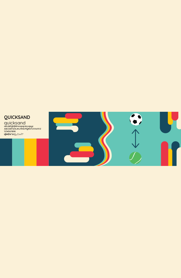
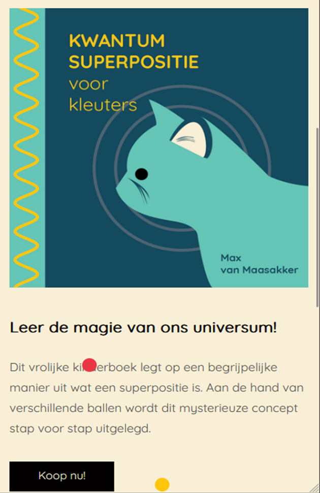
Now that I created a children's book, I need to promote it. I created the branding for the book that fits the illustrations and the target audience, the kids. The bright and high contrast colours are appealing to children while the sans serif font makes it more modern, playful and makes it easy to read for children. To promote this book, I created a website. The website has all the colors, shapes and fonts from the branding stylescape. It gives information about the book and an option to buy it.
While it was quite a challenge to convert such a topic to an understandable topic for kids, the book and the marketing products were well perceived by my teachers.